
Kiosk Accessibility
CLIENT / TIMELINE
Pilot Company
September – October 2022
THE TEAM
1 designer, 1 product owner, 2 engineers
MY ROLE
Accessibility-focused interaction design, user flows, prototyping, development handoff
OVERVIEW
Over 400 Pilot travel centers across the US and Canada have touchscreen kiosks that professional drivers use every day to reserve showers, check in for parking, and more. In 2022, Pilot began rolling out a new kiosk model with a taller screen and a physical navigation device, the uNav, designed to support users with accessibility needs. The problem was that the out-of-the-box uNav experience was awkward and unintuitive.
The goal of this project was to enhance the new kiosk experience, making it compliant with Americans with Disabilities Act (ADA) guidelines and ensuring seamless integration of the uNav. This resulted in updates to the kiosk interface, new uNav behaviors, and the introduction of quick-action controls for common tasks.

Understanding ADA guidelines and kiosk experiences
Before diving into the work, I reviewed ADA requirements for interactive kiosks, researched comparable solutions (e.g., at McDonald’s), and worked with the dev team to gain a better understanding of what was possible.
The ADA provides detailed guidelines for interactive kiosks. Because of the tall kiosk’s height, ADA guidelines require that any interactive content above the lower portion of the screen be fully operable using the uNav. This constraint fundamentally shaped our final solutions, as many interactive kiosk elements sit outside of that range.
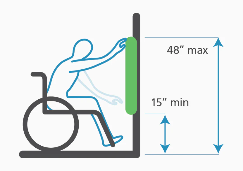
Image from Kiosk Group
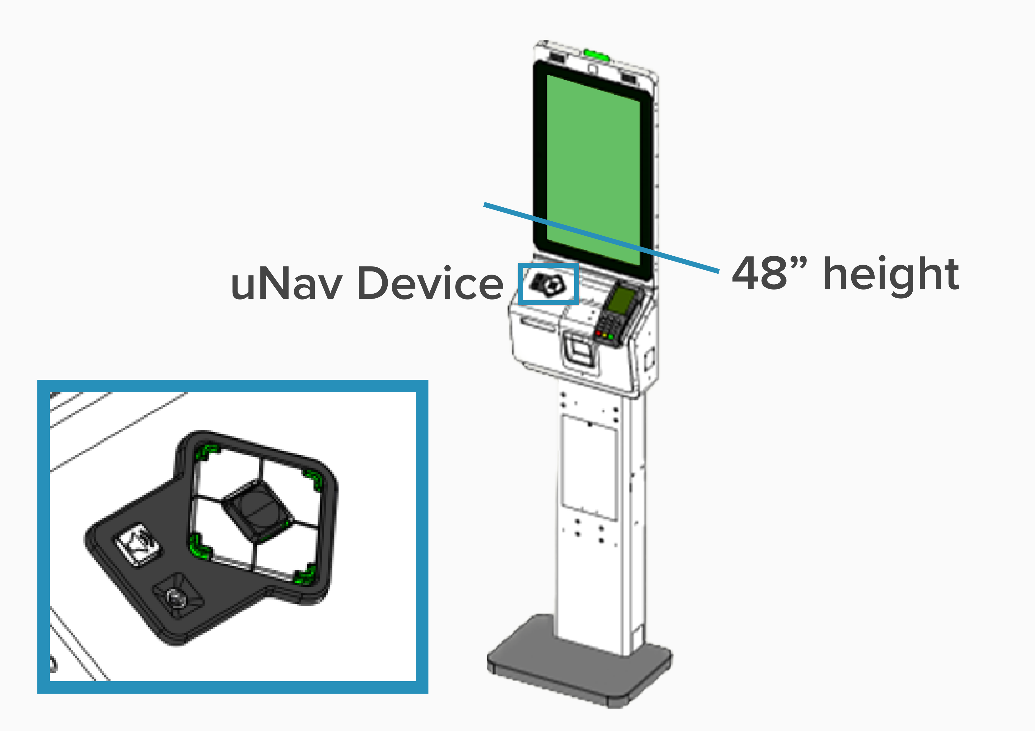
Tall kiosk diagram
I looked at case studies for other kiosk experiences and visited places in my city that I knew had interactive kiosks, including the Port Authority Bus Terminal and McDonald's.
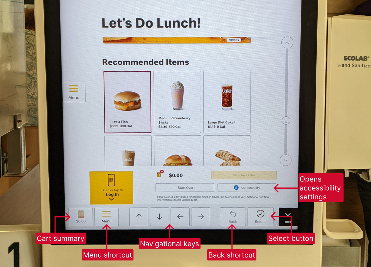
McDonald's kiosk accessibility features
Lastly, conversations with the engineering team highlighted the capabilities and limitations of the uNav device. This groundwork helped identify three main opportunity areas for enhancing the kiosk experience.
Key design solutions
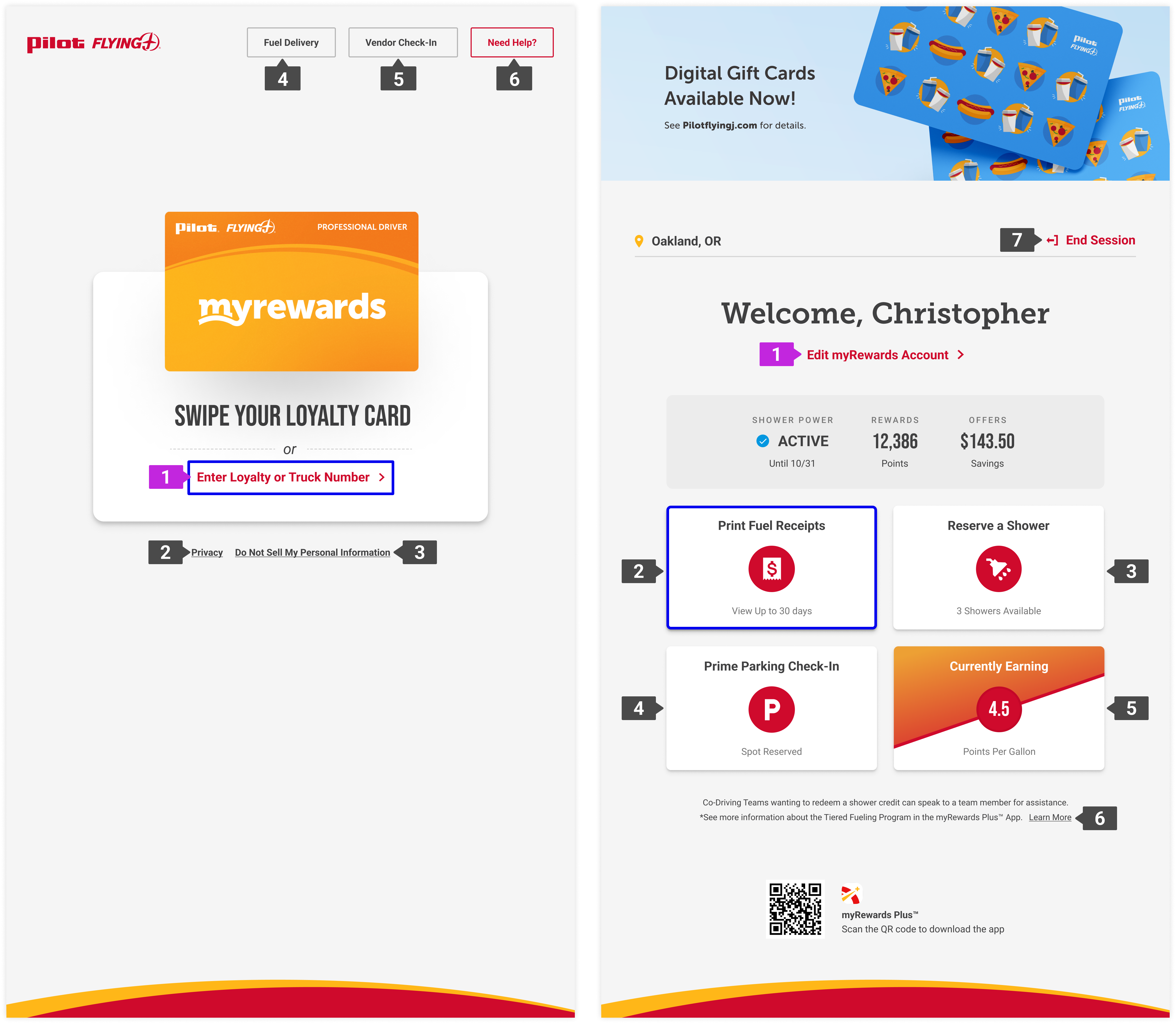
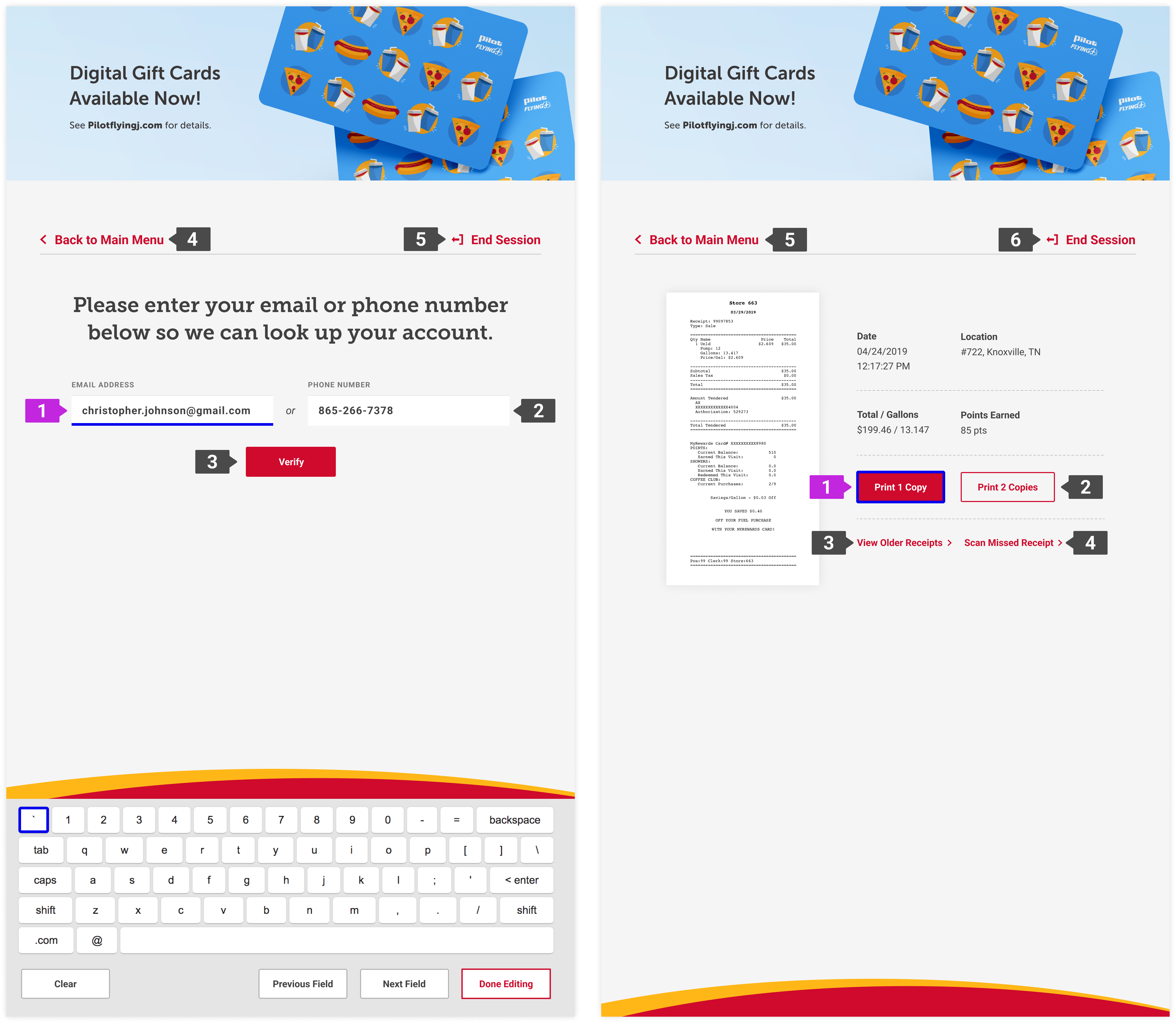
1. Defining focus order and visibility
Drivers usually know exactly what they need and spend less than a minute at the kiosk, and uNav users should be able to move just as quickly. The default top-to-bottom, left-to-right order would have forced them to step through unnecessary actions, especially on the start screen and main menu.
I grouped the kiosk screens into a few core page types and defined a focus order for each. I also replaced the default yellow outline with a higher-contrast focus state and added a second indicator for text entry.
2. uNav activation and onboarding
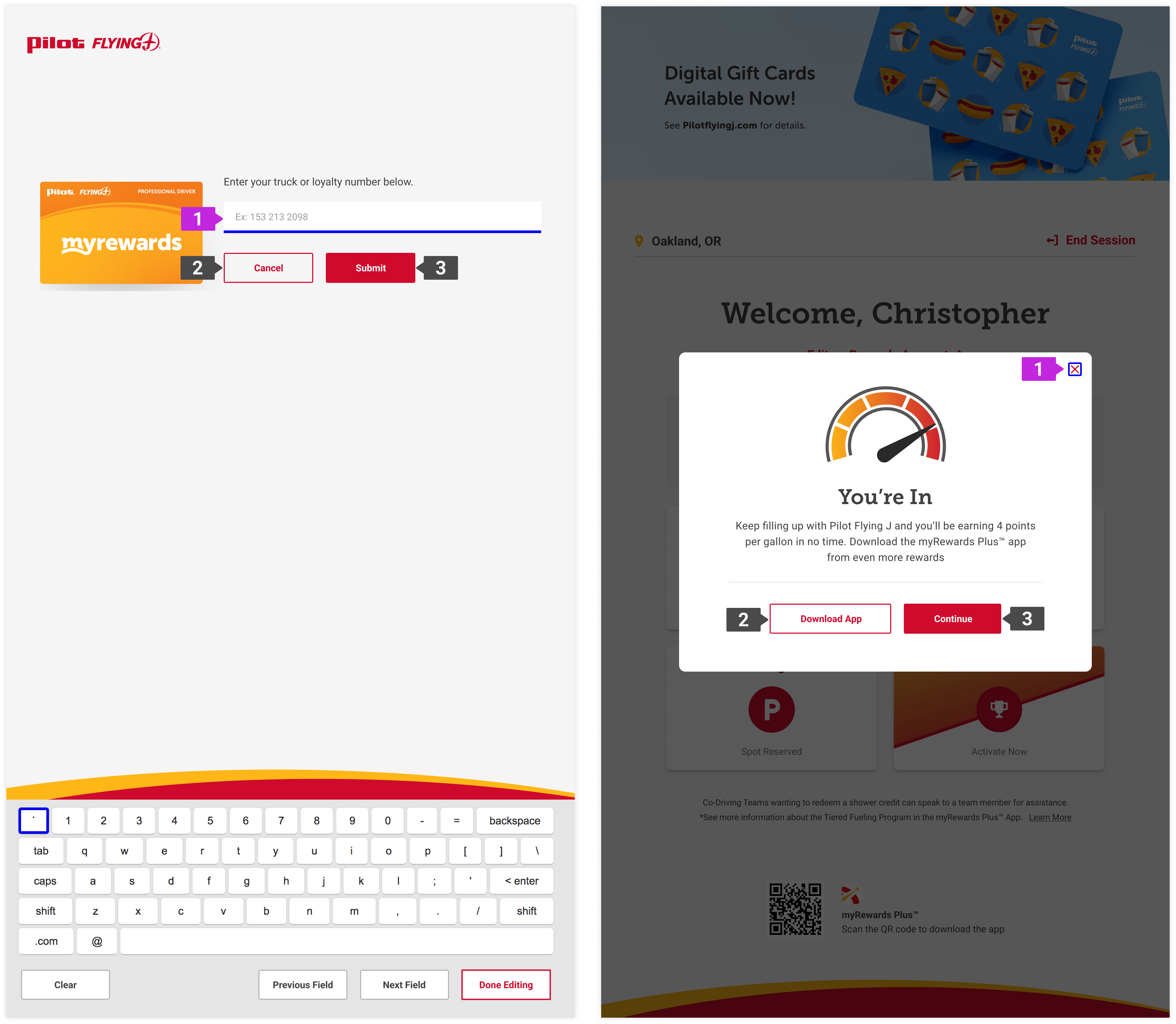
The built-in uNav behavior requires a user to reactivate the device every time they navigate to a new screen, which could feel broken or frustrating. To solve this, I collaborated with engineering to explore feasible solutions, and we landed on an on-screen toggle to turn the device on and keep it active throughout a session.
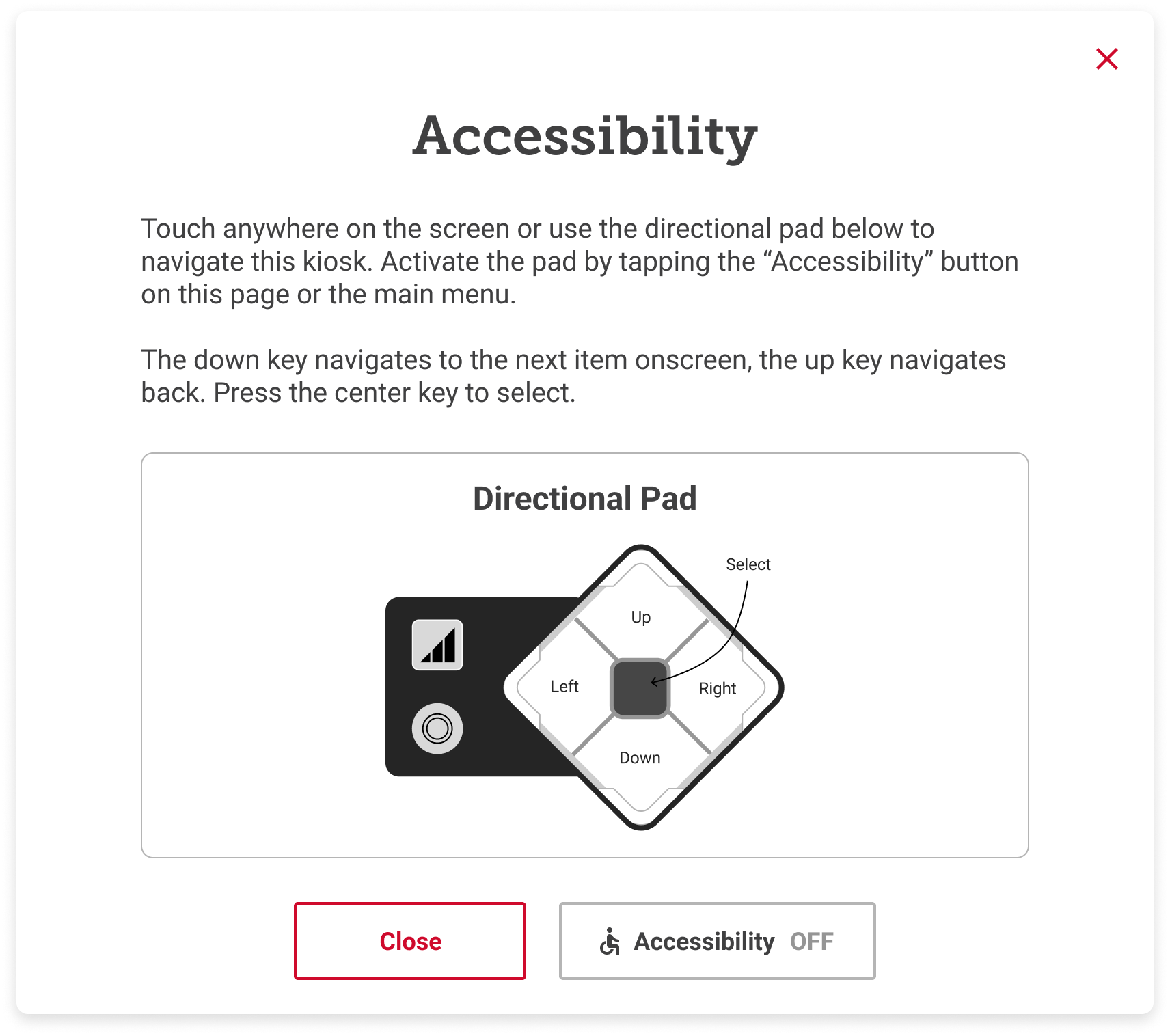
I designed the toggle and, to support first-time users, created a lightweight onboarding modal that quickly explains how to use the device. The toggle and onboarding were placed within ADA-reachable zones and designed to be easily visible but not distracting.
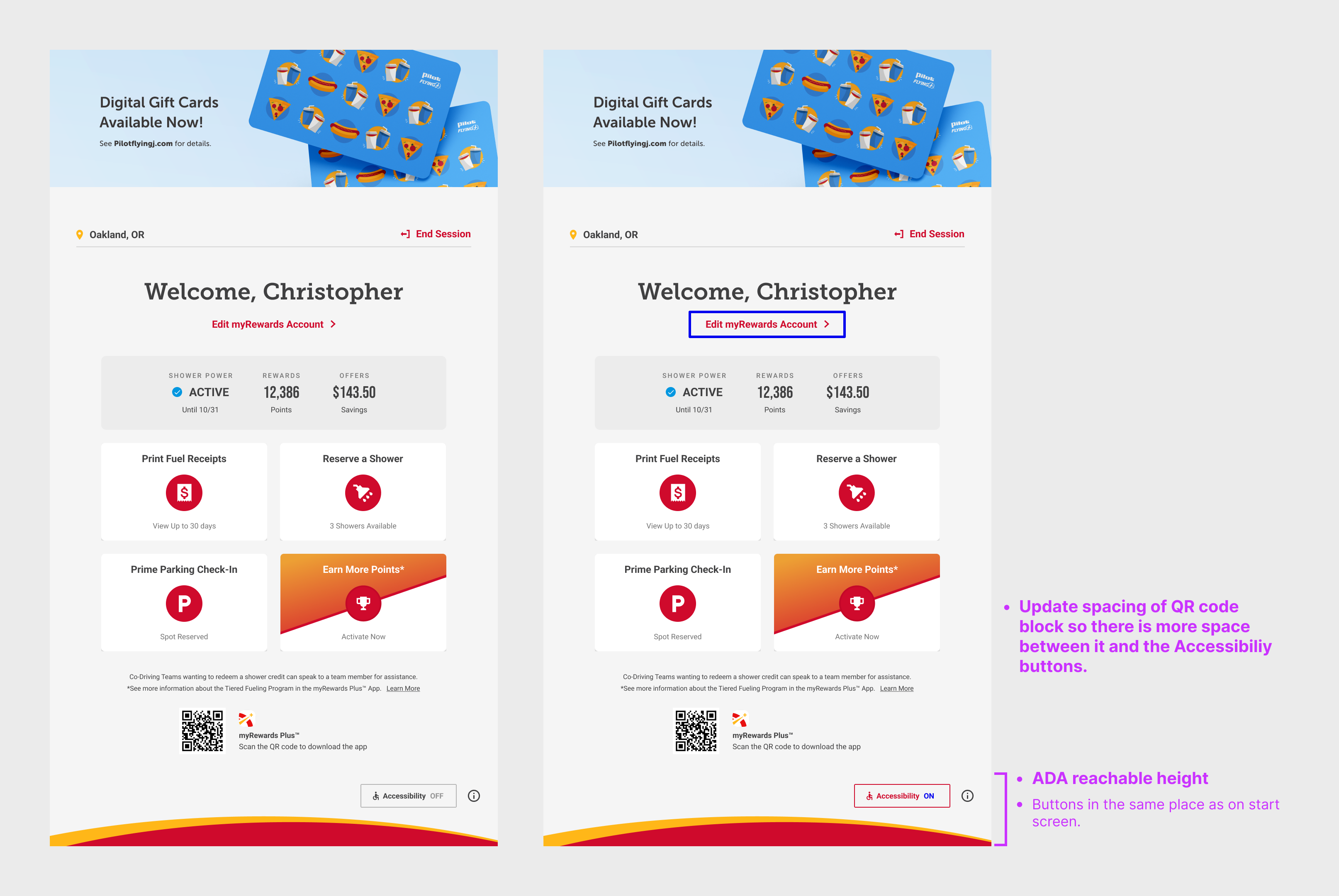
Dashboard with accessibility toggle off/on
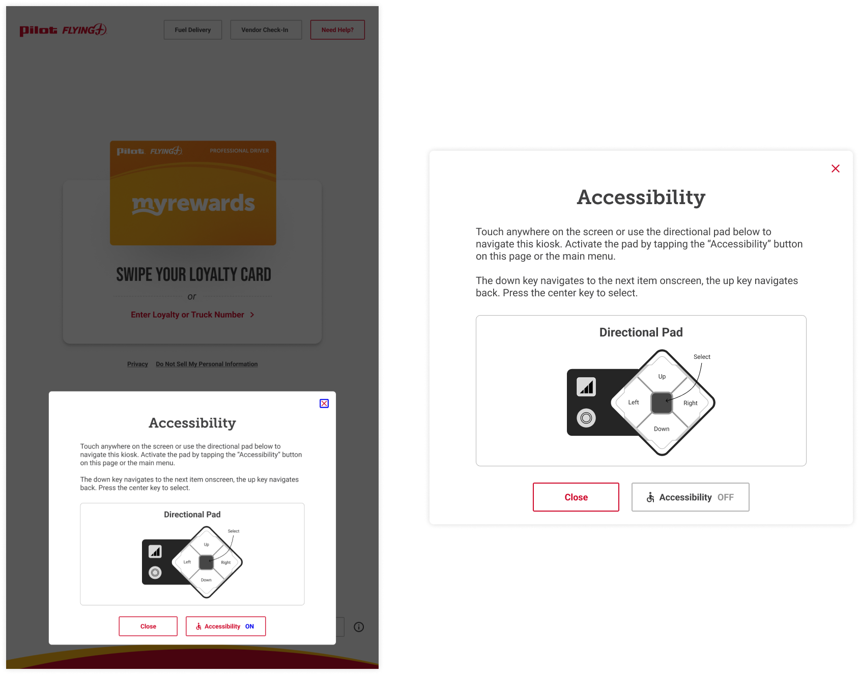
Onboarding modal with diagram and instructions explaining how to use the uNav
3. Keyboard use
Text entry was the biggest challenge. The existing keyboard was designed to sit at a comfortable standing height in the middle of the screen, and was not operable with the uNav. The engineering team suggested compressing it to fit entirely within the reach zone, but that introduced new issues around touch target sizes and legibility.
Instead, I moved the keyboard lower on the screen without resizing, allowing some keys to fall inside the reach zone and the rest to be much closer. I also added quick-action buttons to clear a text field, move between fields, and exit text entry with ease.
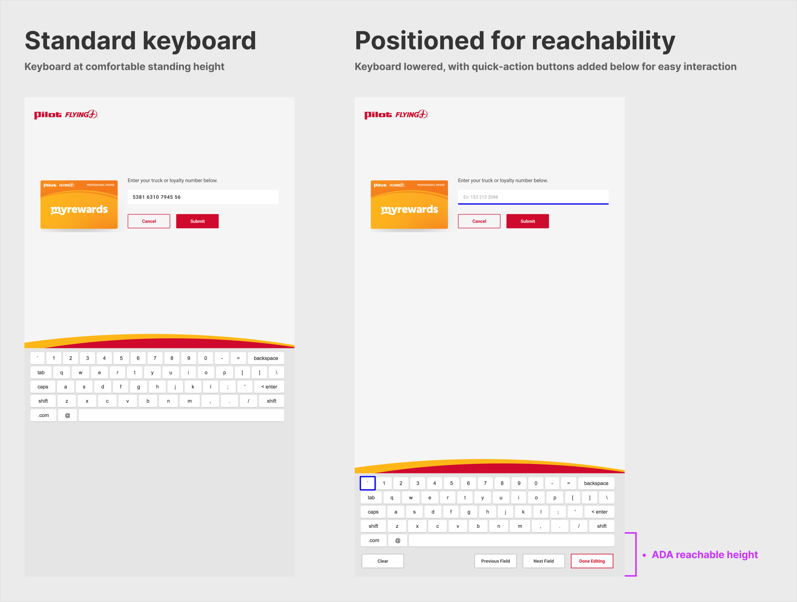
Standard keyboard placement vs. with accessibility mode toggled on
Demo video of keyboard behavior in accessibility mode
The updates launched with the tall kiosk rollout, ensuring ADA compliance and a simple, consistent experience for drivers using the uNav. This project reinforced the importance of building accessibility into the core experience instead of treating it as an add-on. Constraints on reach, focus, and operability made interactions simpler and the hierarchy clearer.
