
Kiosk Accessibility
Type
UX Design
Client
Pilot Company
Timeline
September 2022 - October 2022
Overview
Over 700 Pilot travel centers across the US and Canada have touchscreen kiosks that professional drivers use daily. In 2022, Pilot began rolling out a new, taller kiosk model that has a physical navigation device, the uNav, designed to support users with accessibility needs.
The goal of this project was to enhance the new kiosk experience to be compliant with ADA guidelines and ensure seamless integration of the uNav. This resulted in updates to the kiosk interface, new uNav behaviors, and the introduction of quick-action controls for common tasks.
My role
I led the four-week design effort of this project, working closely with the two main engineers and the product owner to shape the kiosk experience. I was responsible for:
- Accessibility-focused interaction design
- Defining uNav behaviors and logic
- Prototyping user flows
- Visual refinements and design documentation for development handoff
Background
Before diving into the work, I reviewed ADA requirements for interactive kiosks, researched comparable solutions (e.g., at McDonald’s), and worked with the dev team to gain a better understanding of what was possible.
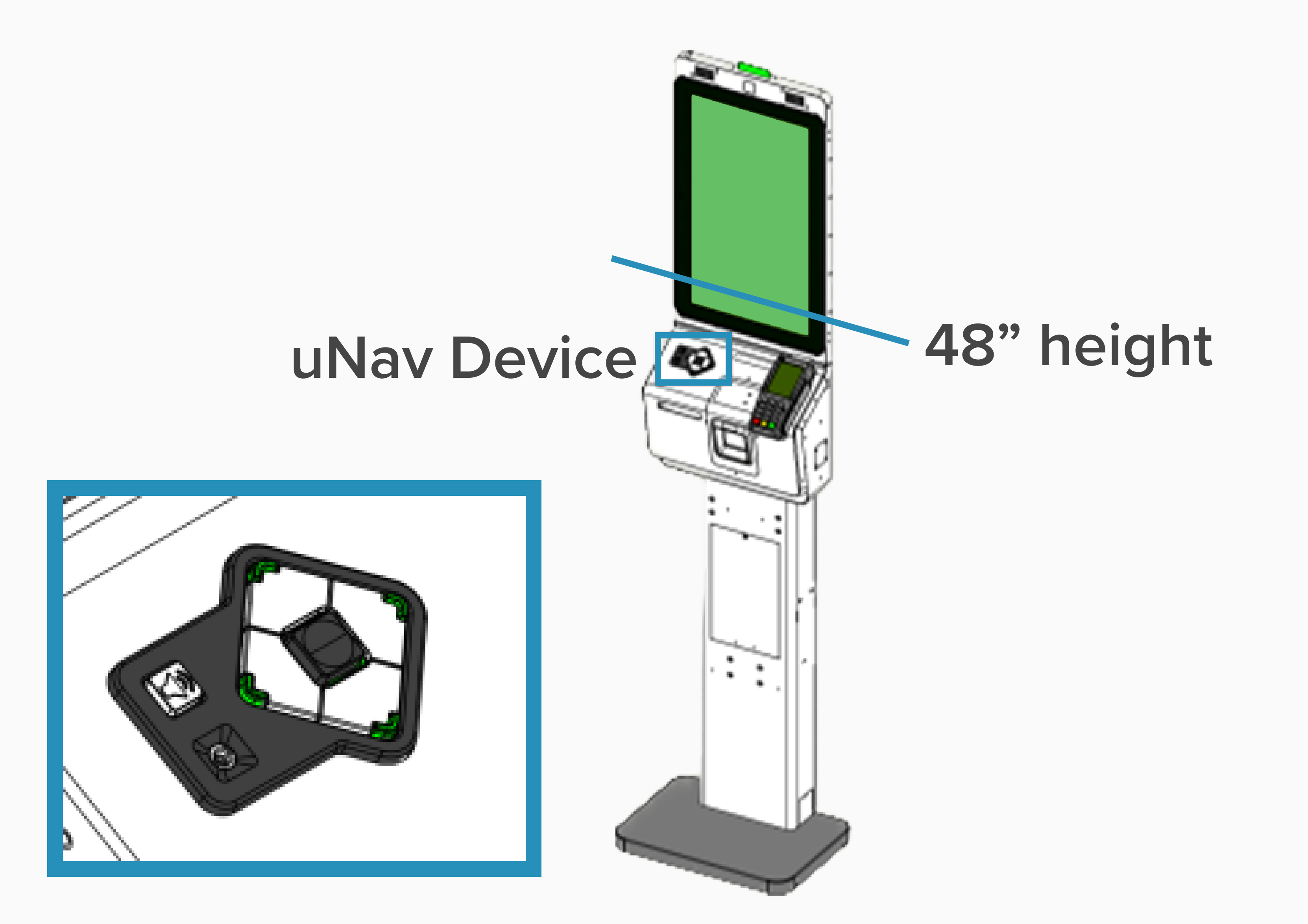
The Americans with Disabilities Act provides detailed guidelines for interactive kiosks. Because of the tall kiosk’s height, ADA guidelines require that any interactive content above the lower portion of the screen be fully operable using the uNav. This constraint fundamentally shaped our final solutions, as many interactive kiosk elements sit outside of that range.
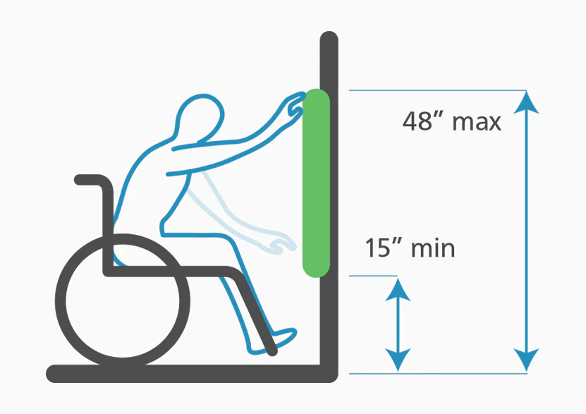
Image from Kiosk Group
Tall kiosk diagram
I looked at case studies for other kiosk experiences and visited places in my city that I knew had interactive kiosks, including the Port Authority Bus Terminal and McDonald's.
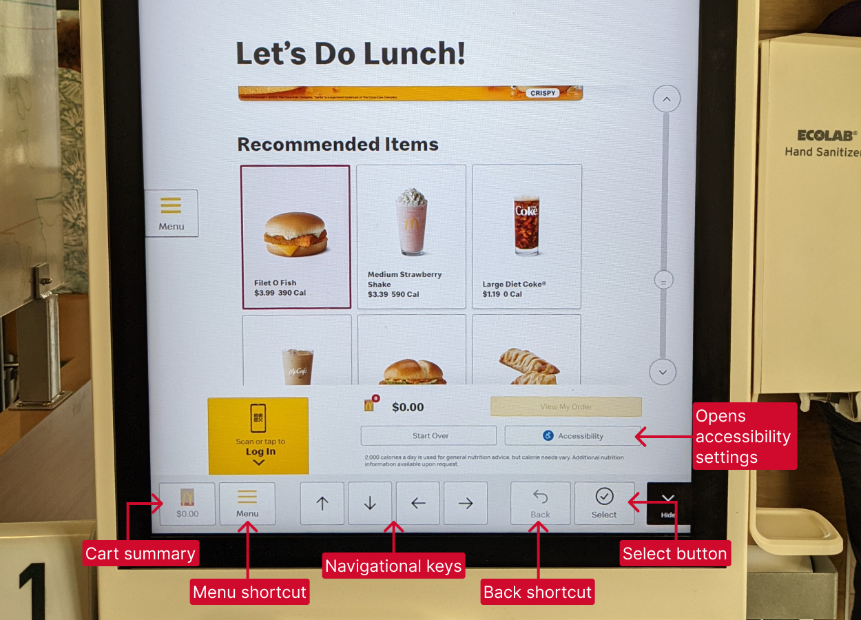
McDonald's kiosk accessibility features
Lastly, conversations with the engineering team highlighted the capabilities and limitations of the uNav device.
This groundwork helped identify major opportunity areas for enhancing the kiosk experience for users in need of navigational support.
Key design solutions
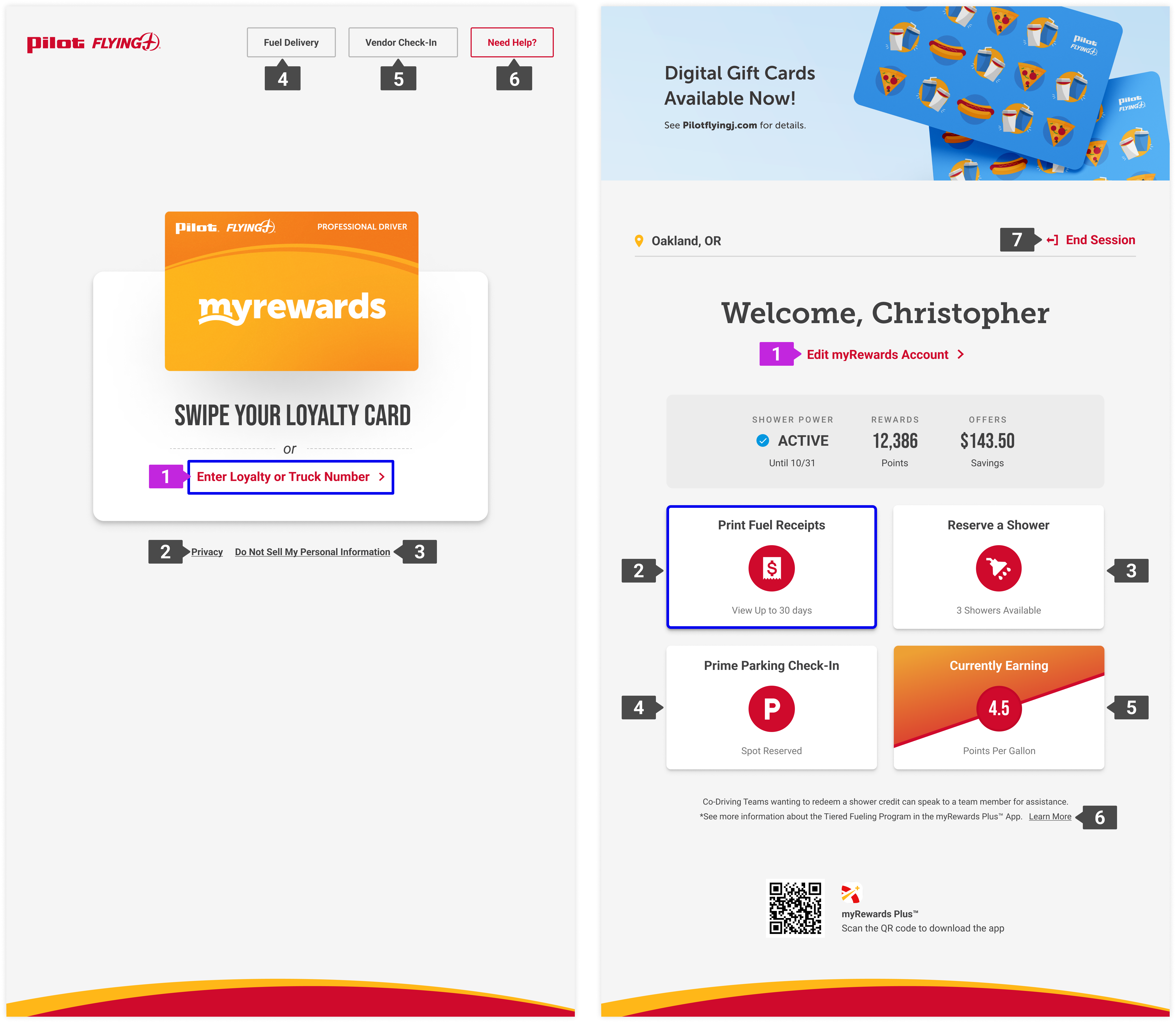
Defining focus behavior for visual clarity
Kiosk interactions are typically carried out quickly and frequently, as most drivers know exactly what they want to do and spend less than a minute at the screen. Thus, efficient navigation was critical; the default top-to-bottom, left-to-right approach was not always the most efficient.
I audited kiosk screens and categorized them into core page types, then defined the appropriate focus order for each. I also ensured we implemented a custom focus state to maintain sufficient contrast across the interface and introduced a secondary focus indicator for text entry.
These decisions ensured the uNav experience felt intentional and clear across different flows.
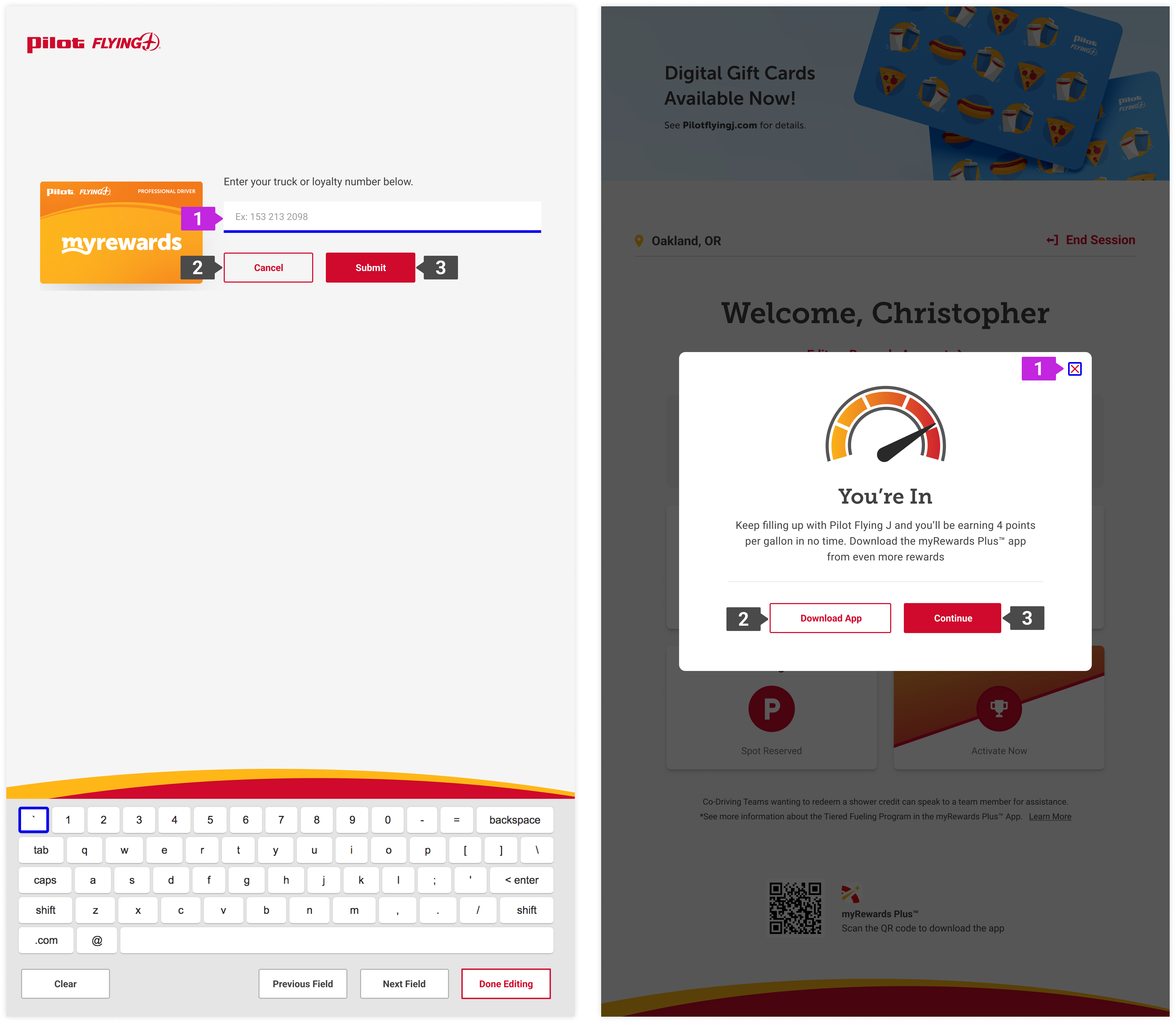
uNav activation and onboarding
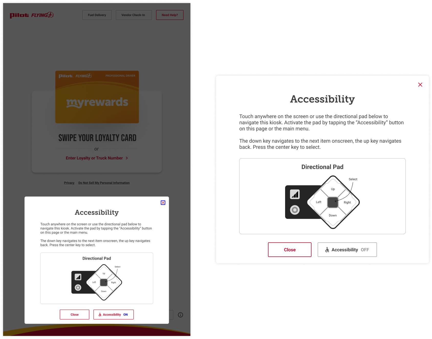
The built in uNav behavior requires a user to reactivate the device every time they navigate to a new screen, which could feel broken or frustrating. To solve this, I collaborated with engineering to explore feasible patterns and we discovered an on-screen toggle could be used to turn the device on and keep it active throughout a session.
I designed the toggle and, to support first-time users, created a lightweight onboarding modal that quickly explains how to use the device. The toggle and onboarding were placed within ADA-reachable zones and designed to be visible without interrupting repeat users.
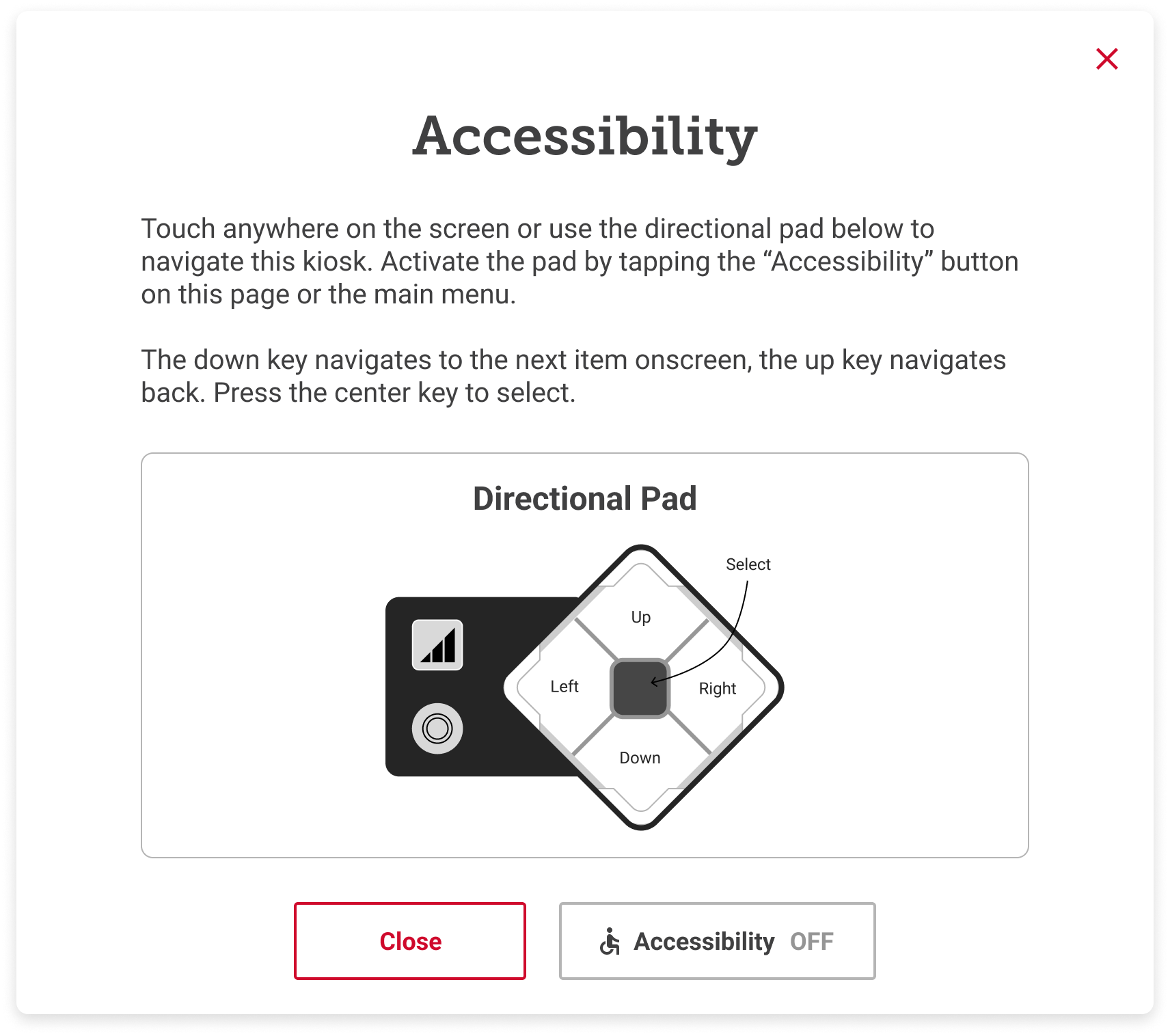
Dashboard with accessibility toggle off/on
Dashboard with accessibility toggle off/on
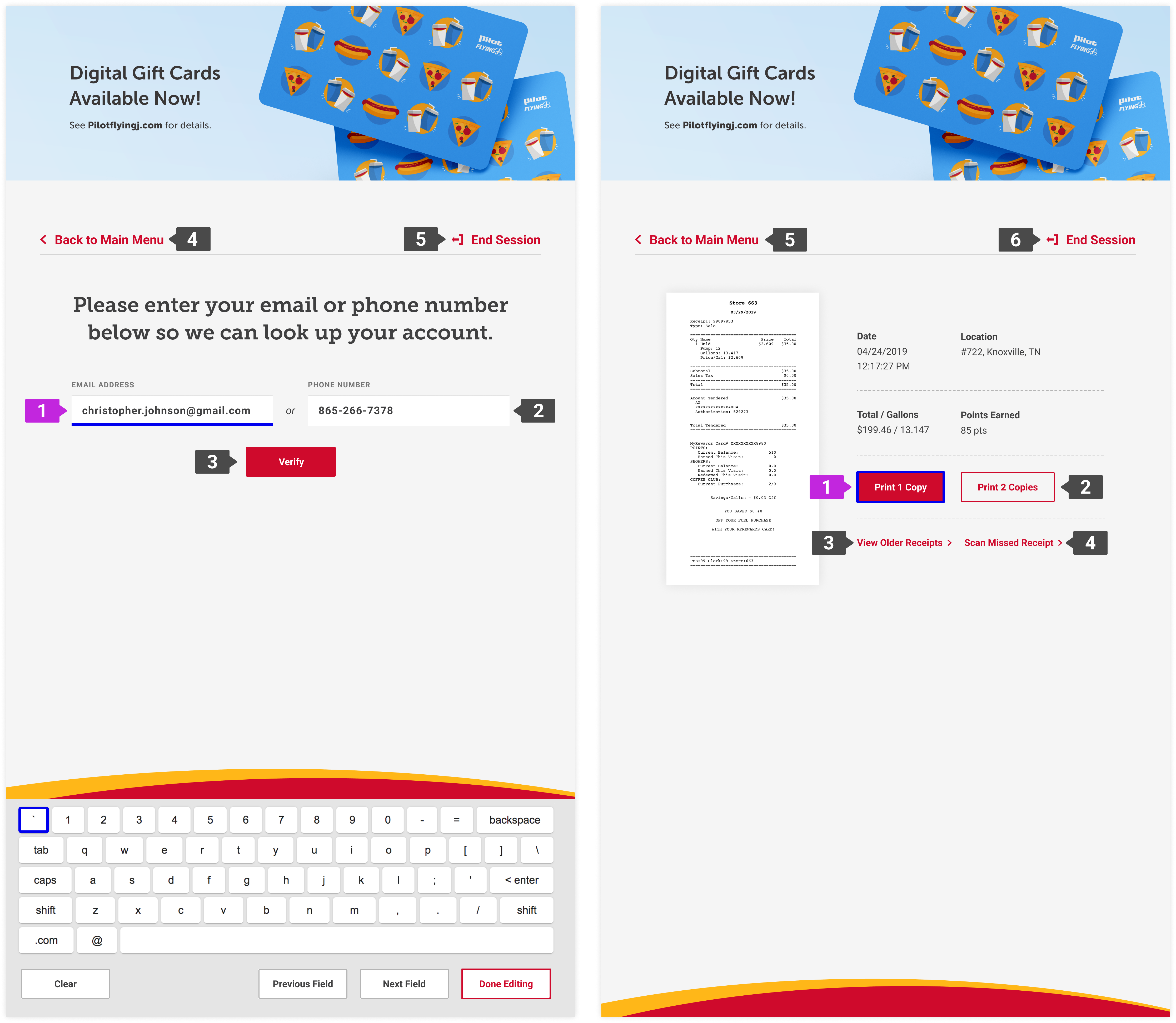
Keyboard use
Text entry posed a significant usability challenge. The existing keyboard was not fully operable with the uNav and could not be resized without introducing new issues.
We defined a modified keyboard experience that balanced effort and usability. We adjusted the keyboard position to be responsive, moving it into a reachable range if the uNav is active instead of keeping at its default standing height. I also introduced quick-action controls to clear the text field, to navigate between fields, and to exit text entry easily, creating an easier navigational experience.
Outcomes
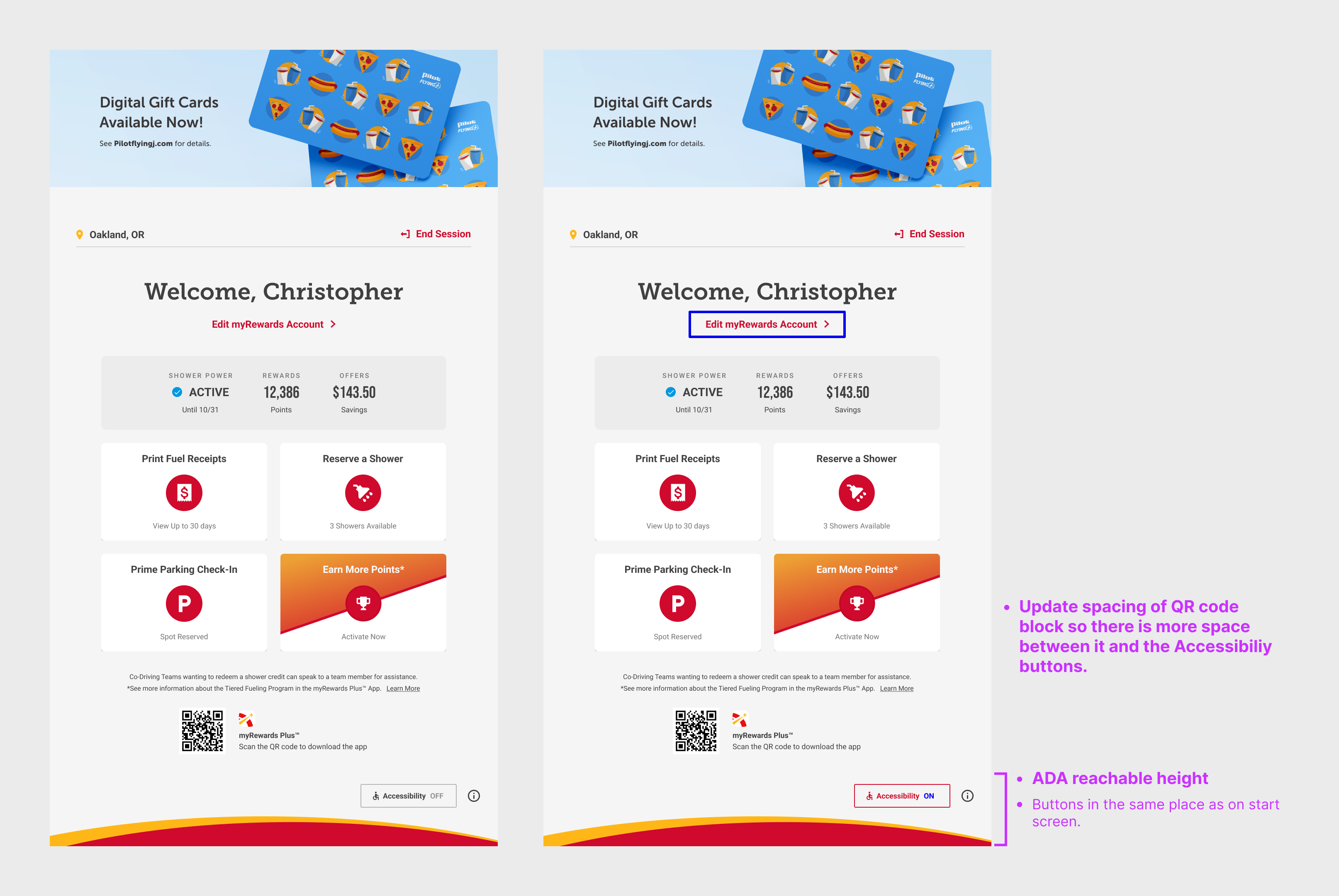
The updated kiosk experience launched alongside the new tall kiosk rollout. The work established a clearer, more reliable interaction model for users relying on the uNav and ensured ADA requirements were met without sacrificing efficiency for repeat users.
The project also laid the groundwork for future accessibility improvements, including screen reader support and expanded accommodations.
Takeaways
This project reinforced the importance of designing accessibility into the core experience rather than treating it as an add-on. Constraints around reach, focus, and operability became valuable tools for simplifying interactions and clarifying hierarchy.
Check out another project
Airport Website TransformationHelping travelers find their way
Prime ParkingEnabling stress-free reservation management
Digital AssistantCrafting complex conversations