
Digital Assistant Redesign
Type
UX Design
Client
Verizon
Timeline
August 2021 – December 2021
Overview
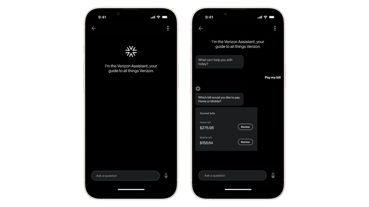
The Verizon Assistant is a conversational interface that helps customers manage billing and account-related tasks. Verizon customers are divided into three segments: wireless (mobile services), wireline (internet services), and joint (both). Prior to this work, wireless and wireline customers had separate digital tools, resulting in siloed, inconsistent experiences. Joint customers were most negatively impacted by this as they had to log into two different platforms to complete similar tasks.
As part of a broader initiative to unify Verizon’s digital ecosystem, our team was tasked with redesigning the assistant to support all customer segments in one single, cohesive experience.
My role
I owned the initial conversational design of four billing intents, mapping flows, creating wireframes, and reviewing high-fidelity designs for usability and accessibility.
I later contributed to the documentation effort for the entire project by organizing an index of 90+ flows, documenting component behaviors, and annotating designs for accessibility.
Designing conversational flows
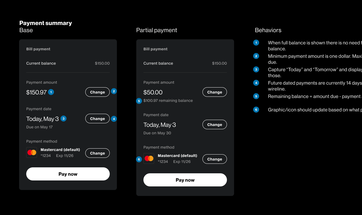
The team designed over 90 conversational flows across common billing-related intents. I owned four of these intents (reviewing bills, viewing payment history, and making payments) and mapped out the key steps required to get users to their goals. I worked closely with the project manager to understand business rules, technical constraints, and segment-specific requirements that would influence these interactions.
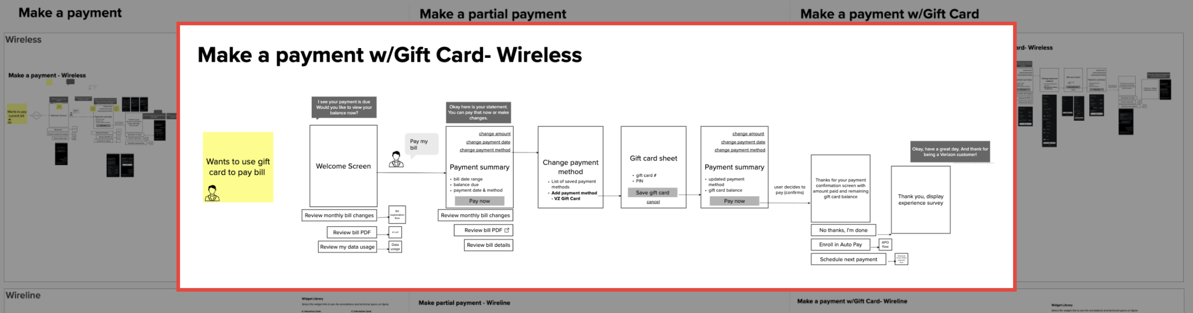
I translated these flows into low-fidelity wireframes, balancing plain text responses with interactive widgets and contextual suggestions. Text responses feel natural and keep the conversation flowing, while widgets are needed for sharing and gathering data and giving clarity. I worked with a pre-existing widget library and, where existing components fell short for these specific intents, proposed enhancements to better serve users.
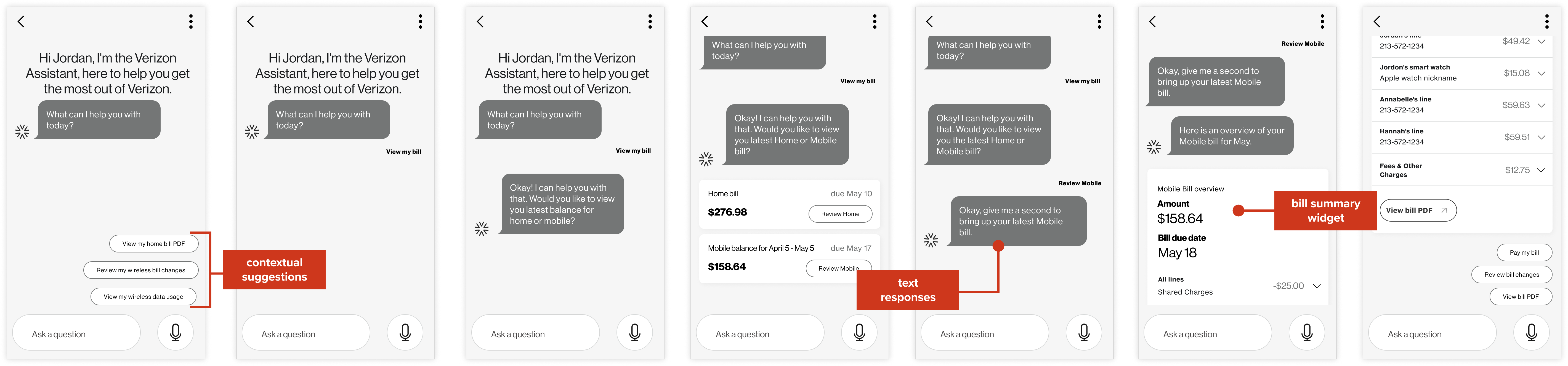
Once low-fidelity designs were approved, a visual designer translated them into high-fidelity, brand-aligned designs. I reviewed visual treatments for usability and clarity, flagged accessibility concerns, and helped create prototypes for client presentations.
Documentation and delivery
Structured documentation was critical for delivering this work for development. I helped organize the work to make consistent implementation possible.
Organizing conversational flows
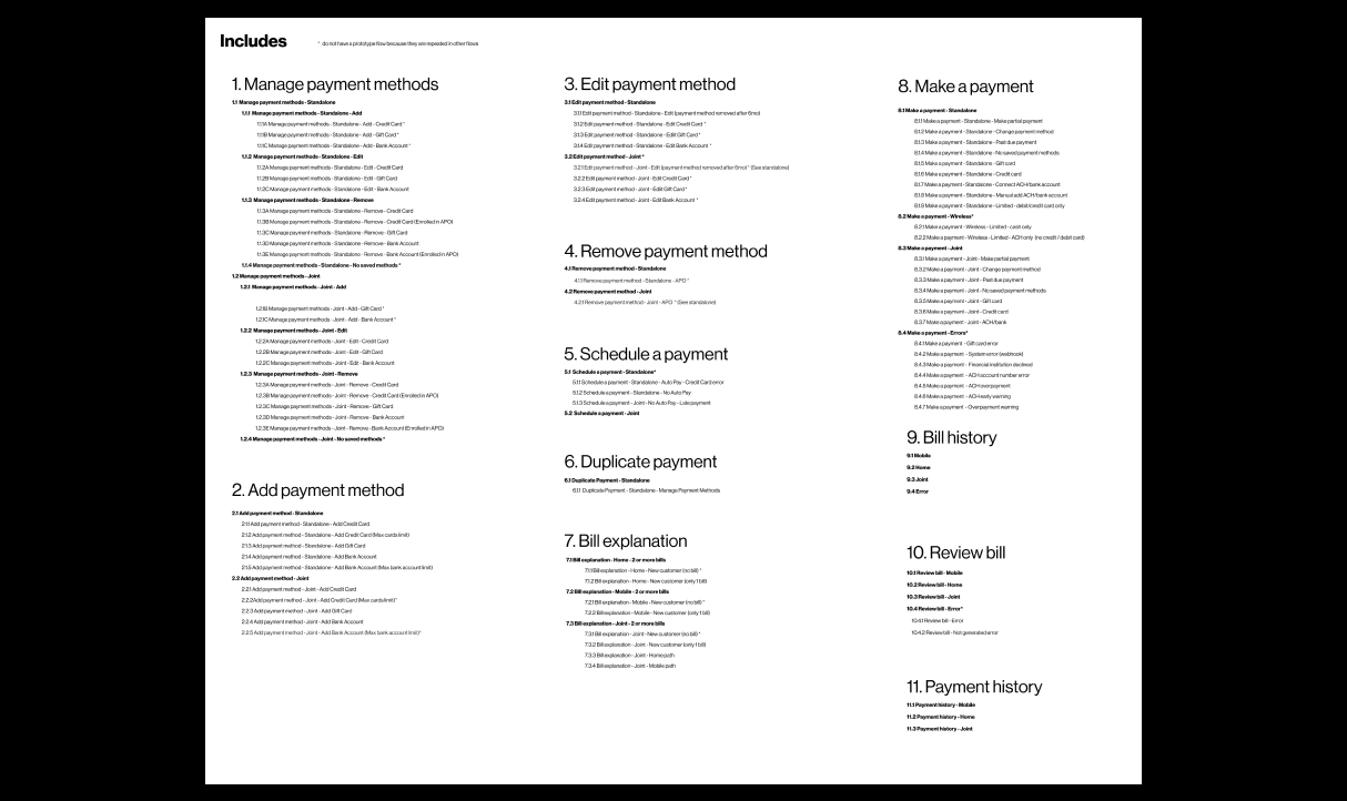
We created a structured index of all flows, organized by intent, customer segment, and additional subcategories as needed. Each entry linked directly to the latest fully prototyped Figma file, allowing developers to quickly find and reference designs.
Documenting components
We documented the anatomy and behaviors of all widgets, CTAs, system responses, and other UI elements. I specifically worked in collaboration with the project manager to document the behaviors of many interactive widgets.
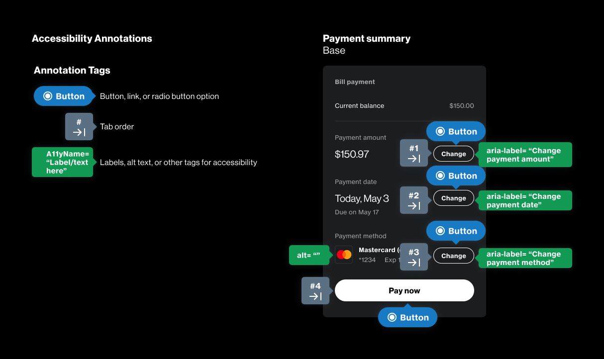
Accessibility annotations
I helped adapt and implement an annotation system for screen reader compatibility and annotated the majority of flows myself. Before rolling off, I onboarded other designers to the method so the work could continue consistently and the system could be used for future projects.
Impact
The redesigned assistant launched in early 2023 and, while some changes were made during implementation, the final product remains true to what my team designed. It creates a unified experience across all customer segments, eliminating the need for joint customers to manage billing across two separate platforms. The documentation systems gave the development team everything they needed for consistent, accessible implementation.
Check out another project
Airport Website TransformationHelping travelers find their way
Prime ParkingEnabling stress-free reservation management
Kiosk AccessibilityEnhancing an assistive device